

I was Art Director at Eveo for 3 years, leading design across 10+ healthcare and pharmaceutical products for clients like Genentech, GSK, and Amgen. Accuracy, compliance, and clarity were non-negotiable. The largest was ShoutMD, a professional network and social commerce platform for board-certified physician specialists. I led it across native iOS and web from launch through early scale, growing from roughly 1,000 founding members to 4,000 across five specialties in the US, Canada, Europe, and Asia. The platform later reached 20,000 members, and ALPHAEON acquired Eveo to scale it globally.
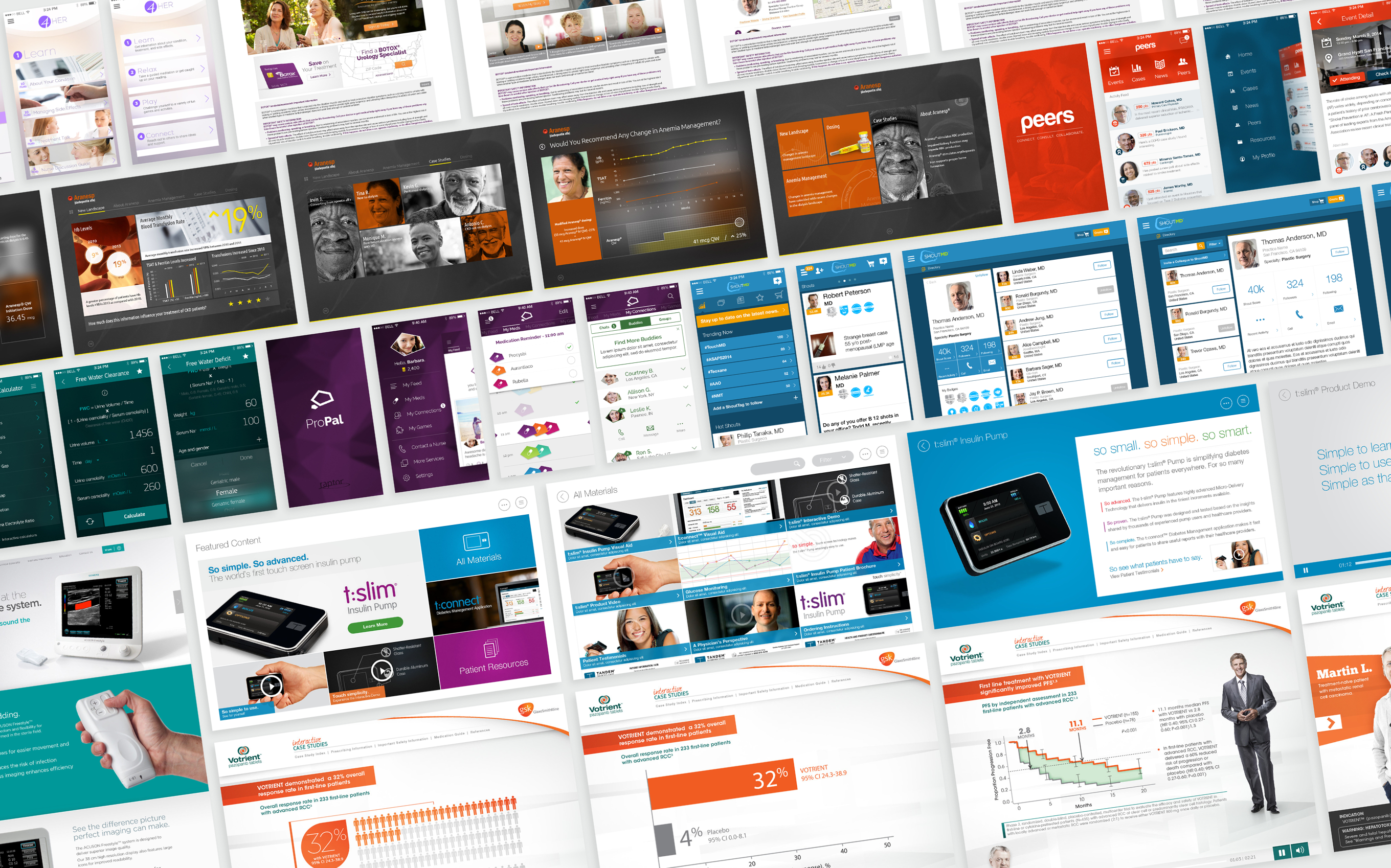
Across all audiences the baseline challenge was the same. Information had to be accurate, interfaces had to be clear, and outputs had to be trustworthy enough that users could act on them with confidence.
But each audience brought its own layer on top of that. For clinicians it was accuracy and confidence in what they were prescribing or advocating for their patients. For pharmaceutical sales forces it was retention and persuasion under pressure in the field. For patients it was clarity and safety. FDA regulations require that efficacy claims always be accompanied by Important Safety Information covering side effects, warnings, and contraindications, visible above the fold regardless of the device. That constraint shapes layout, hierarchy, and every design decision that follows.
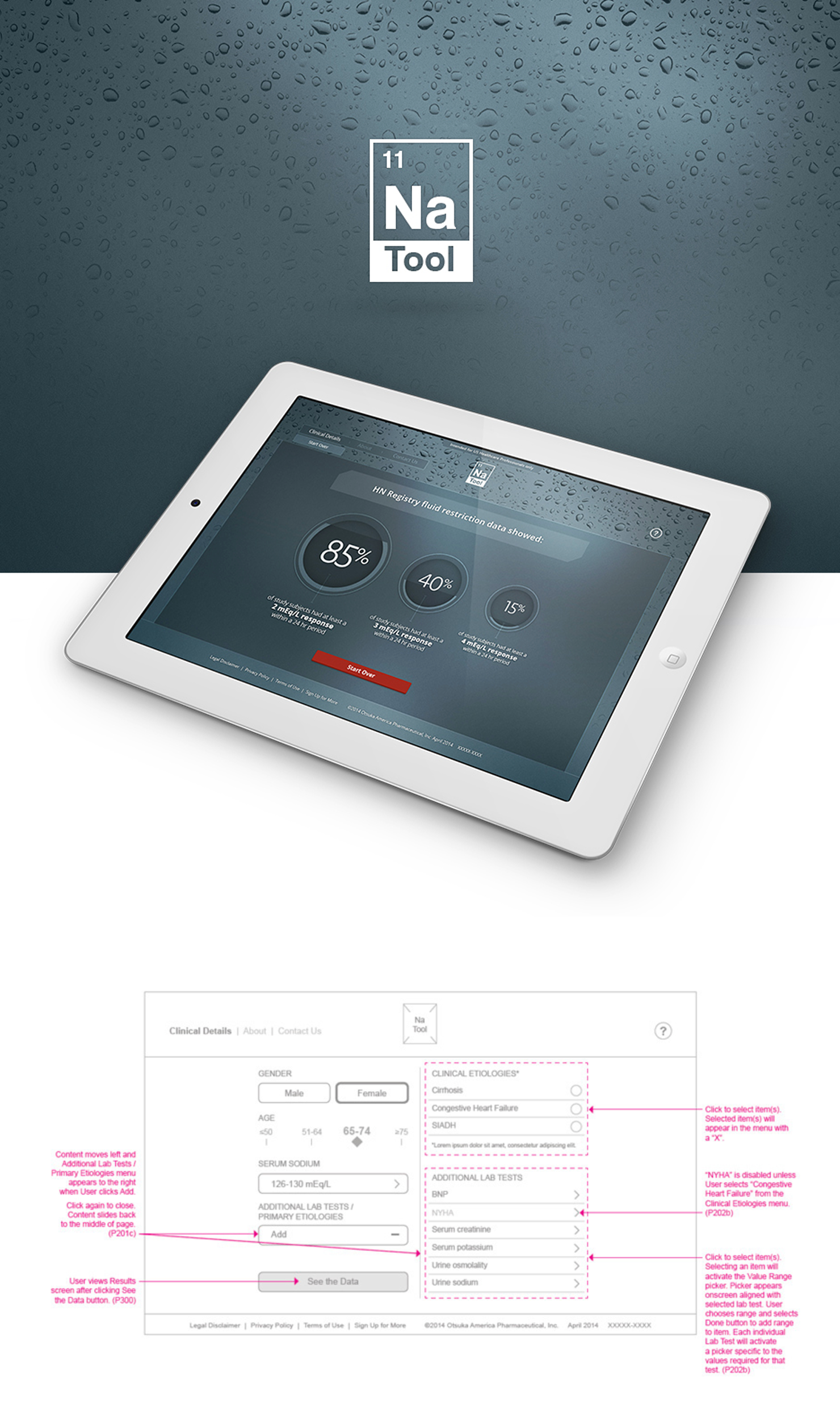
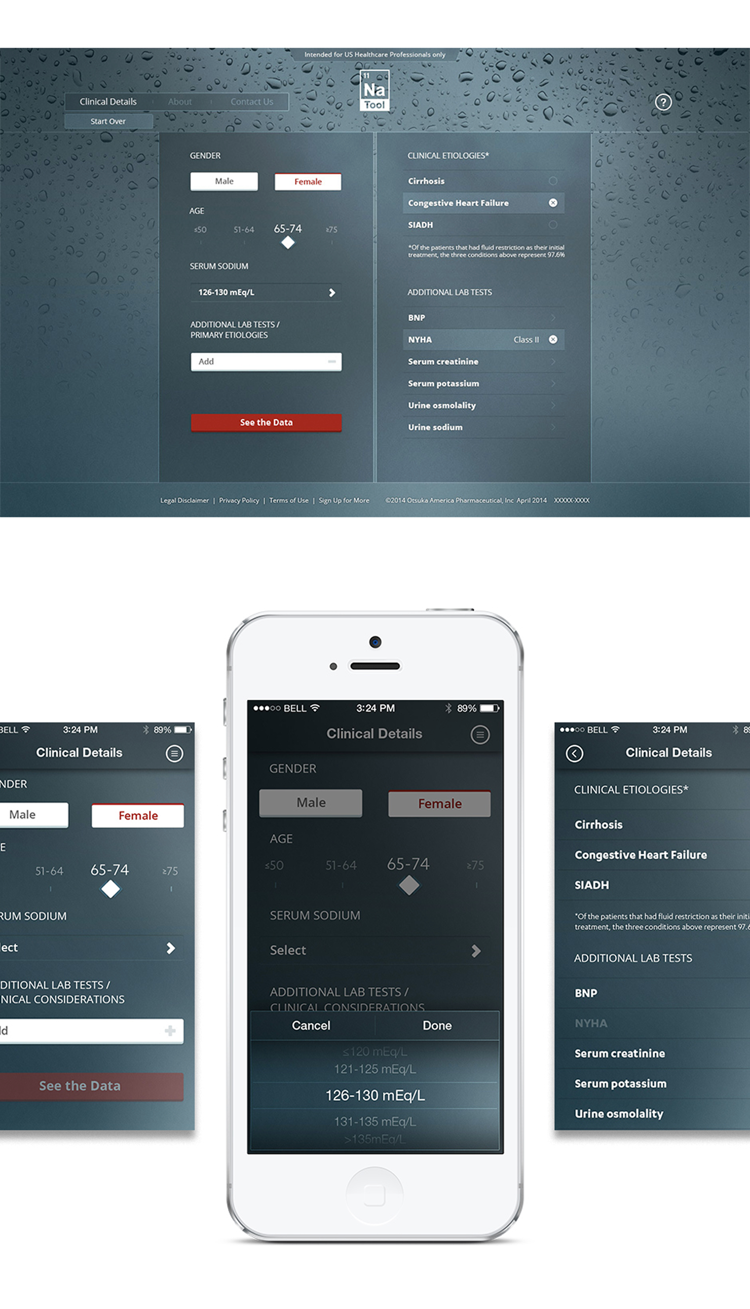
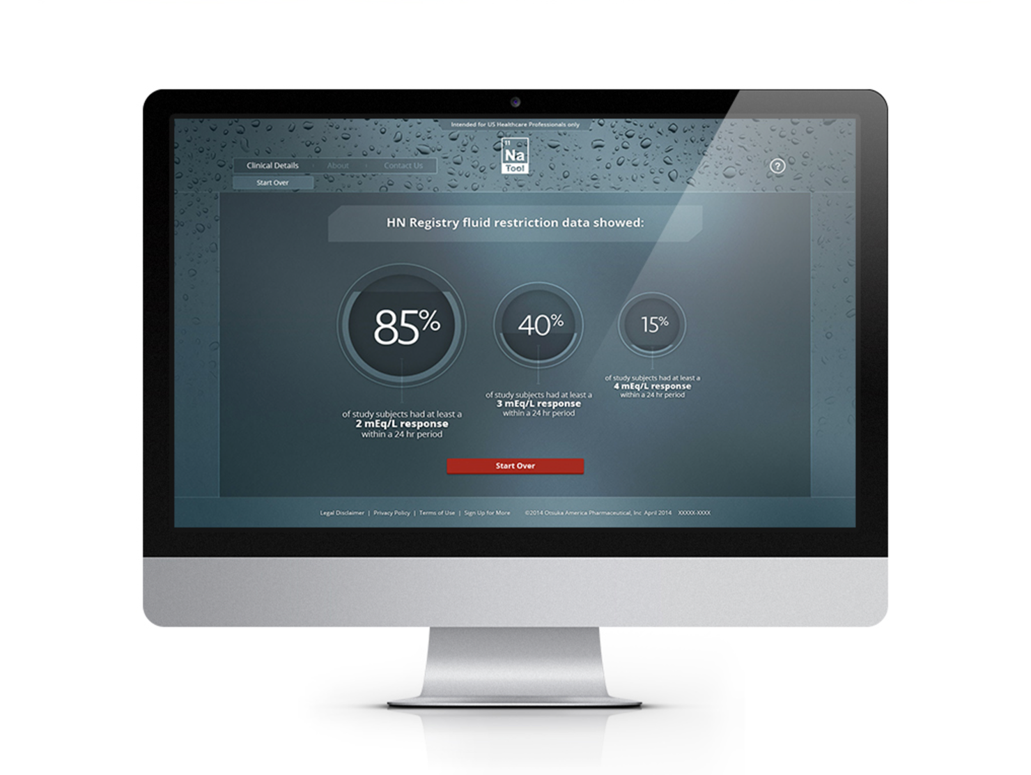
Clinicians treating dilutional hyponatremia were running complex calculations on spreadsheets and outdated legacy tools. We reduced the entire process to a few taps. Clear inputs, precise outputs, and no unnecessary steps.
The original scope was iOS only. After identifying that limiting to one platform meant limiting adoption, a case was made to expand to web. We navigated resource and deadline constraints and shipped both.
Clinicians praised the tool for cutting down calculation time, significantly reducing the need for spreadsheets for the practices using it.
Sales Training at Scale
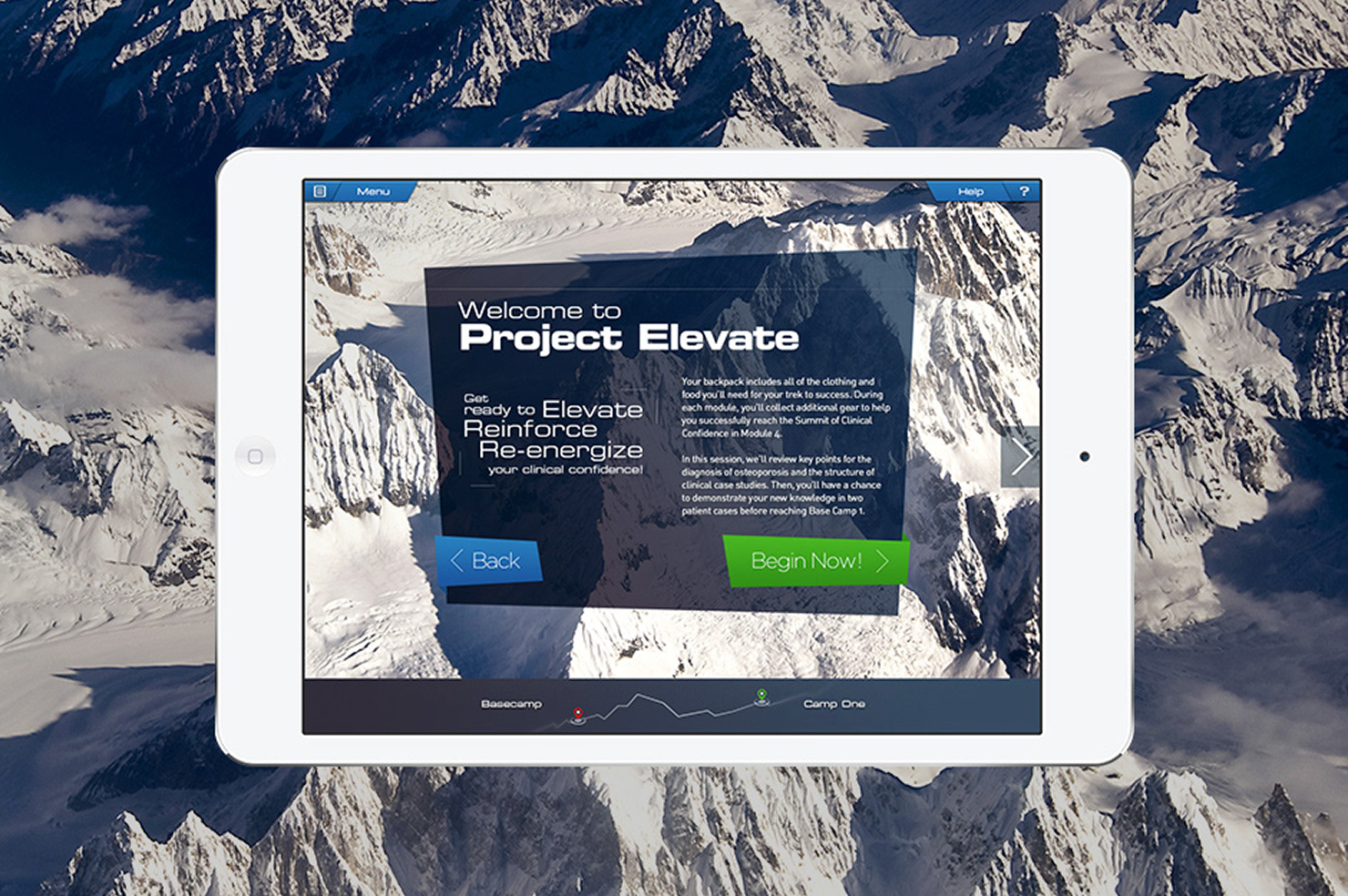
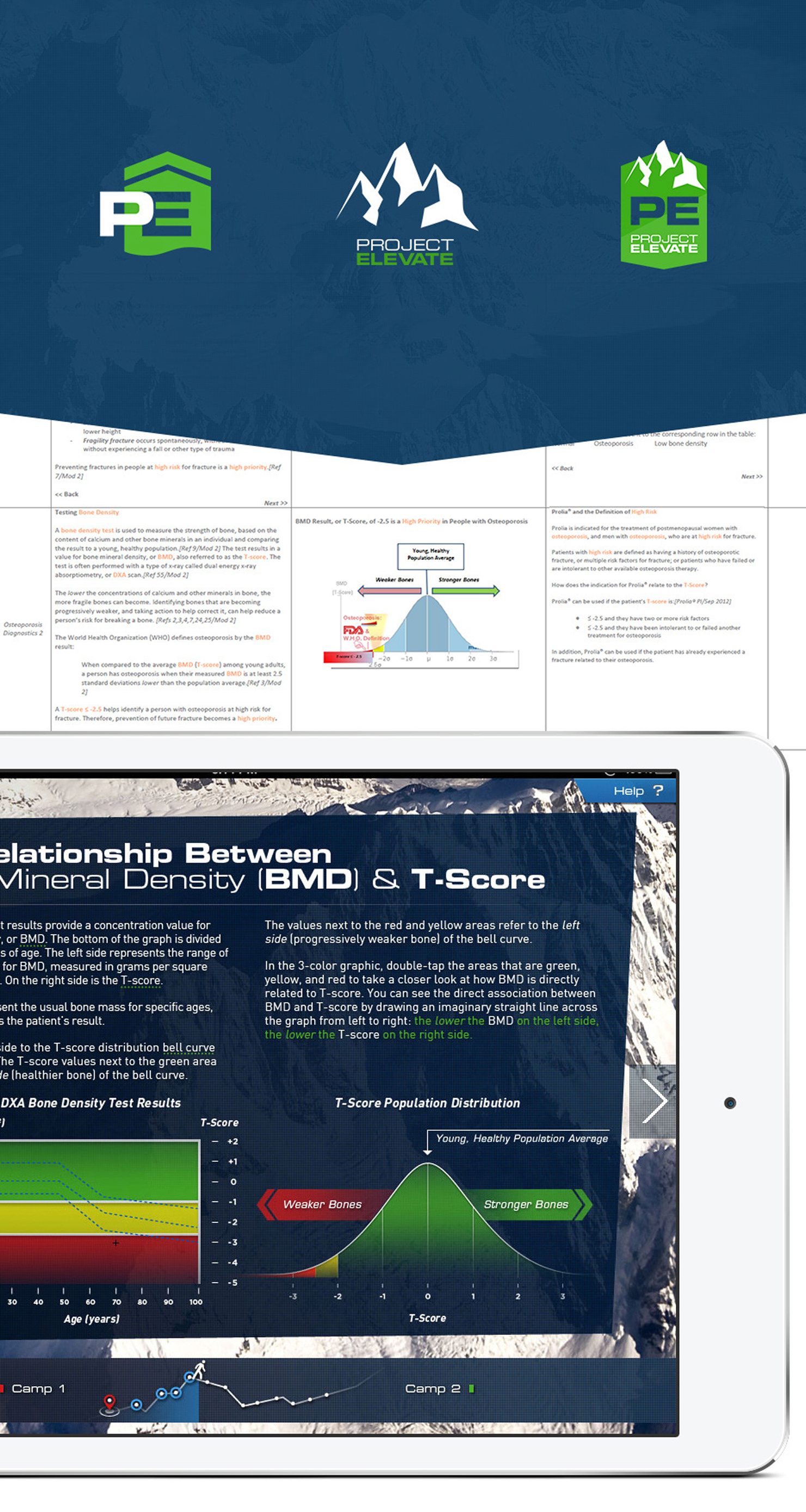
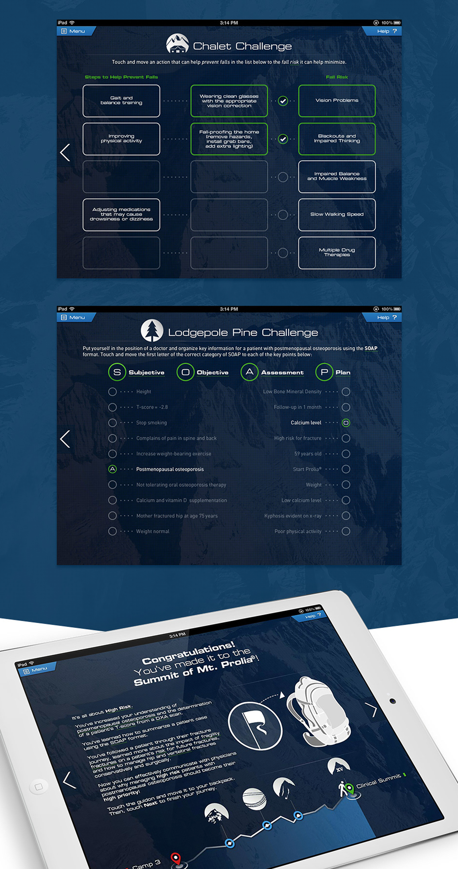
An iPad-based interactive sales training app for the Prolia sales force. 100+ screens. Custom iconography. Gamified learning modules. All built to pharmaceutical regulatory standards.
The core challenge was volume. Prolia reps had to absorb an overwhelming amount of clinical data about osteoporosis treatment and retain it well enough to handle objections in the field. A standard linear training flow would have been overwhelming and less effective.
We needed a structure that made progress feel tangible and kept reps engaged across a long experience. The metaphor of climbing a mountain gave us that. Progress through four modules, called Camps, was visualized as an ascent toward a summit. Each Camp introduced new material through multiple choice questions, quizzes, and match problems. Reps had to move through Camps in order and once a section was complete, it unlocked for non-linear review. The structure gave reps a clear sense of where they were, how far they had come, and what was left. It turned a compliance requirement into something that felt like progress.
Designing in regulated environments where accuracy can have severe implications changes how you think about every decision. The instinct to reduce complexity without losing precision and to make the right path obvious without oversimplifying the problem. That discipline doesn't stay in healthcare. It travels with everything I've designed since.
X CLOSE- ShoutMD scaled from 1,000 founding members to 20,000
- ALPHAEON acquired Eveo to scale the platform globally
- Genentech Marketing Excellence Award for Innovation for 4HER
- 10+ healthcare and pharma products designed and shipped
- Expanded NaTool from iOS to iOS and web, increasing clinician adoption
- 100+ screen training experience built to pharmaceutical regulatory standards